Intro: Background Color Sets the Feeling
When you look at a flower painting, your eyes might go straight to the petals. But guess what? The background is quietly doing a lot of emotional heavy lifting. It frames the flower, defines the style, and adds mood — even if you don’t notice it right away.
So, what kind of feeling do you want your floral painting to give off? Let’s explore how background color can help you tell that story.
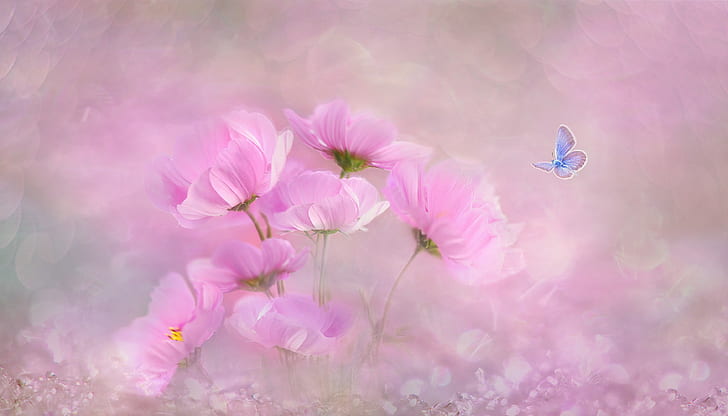
Calm and Romantic: Go for Soft Blush or Pastel Tones
If you’re going for a gentle, dreamy mood, pastel backgrounds are your best friend. Think light lavender, blush pink, pale sky blue — these shades feel soft and poetic.
They work perfectly with roses, cherry blossoms, or any delicate bloom. These colors whisper, not shout. Your painting will feel romantic and peaceful — like a lazy afternoon in spring.
Energetic and Fresh: Use Bright, Light Backgrounds
Want something with a cheerful vibe? Use bright backgrounds like lemon yellow, mint green, or a clean aqua. These shades energize your flowers and add a splash of joy to your canvas.
Sunflowers, daisies, tulips — all look amazing against uplifting, sunshiney colors. Just don’t use a background that’s too saturated, or it might fight with your flowers for attention.
Bold and Moody: Try Deep Contrasts
For those who love drama and emotion in their art, go dark. A deep blue, charcoal grey, or even burgundy can instantly give your painting a moody, modern feel.
This combo works beautifully with white or light-colored flowers. There’s something striking about the contrast that adds intensity and focus.
But make sure the dark doesn’t swallow your subject — keep the shadows controlled, and use a bit of highlight to balance things out.
Earthy and Grounded: Nature-Inspired Backgrounds
Sometimes, the best inspiration comes from outside. Try background tones that feel natural — olive green, warm ochre, or soft brown. These bring a rustic, grounded feeling to the painting.
They work great for wildflowers or botanical-style compositions. It’s like bringing a little garden into your studio. Not every flower needs a perfect sky-blue backdrop.
Feeling Abstract? Let the Background Express Emotion
Who says backgrounds need to be one solid color? If you’re painting in a more abstract or expressive style, use mixed background tones to reflect your mood.
Swirls of pink and yellow can create warmth. A splash of blue and green might evoke calm. The flower is your anchor — the background is your weather.
And yes, it’s okay if the background is a little messy. Sometimes imperfection makes it feel more human.
Practical Tips for Testing Backgrounds
Still not sure which color to go with? Here’s a quick trick:
- Paint a small test square with your background color
- Paint your flower color on top
- Step back and squint a bit
If your flower doesn’t pop or the mood feels wrong, adjust the tone. It’s way better to test before committing your whole canvas.
Ending Thoughts: Let Color Guide the Mood
A well-thought background color doesn’t just “support” the flower. It sings with it. Whether you want your painting to feel happy, gentle, mysterious, or wild — there’s always a background color that can help you get there.
Don’t rush it. Trust your gut. And remember: every flower tells a different story, and the background is half the voice.