Why Depth and Light Are the Soul of Your Painting
Okay, let’s be honest — painting flowers is fun, but sometimes the end result feels a bit… flat. It’s missing that pop. That energy. That little touch that makes people go, “Wow!”
Well, good news — you don’t need to be a master to fix that. With just a few light and depth tricks, even simple flower paintings can look super professional.
1. Block In Values Early
Before you even worry about detail or color, map out your values. Think of them like a grayscale photo of your painting — dark, mid-tone, and light areas. This helps you build structure fast.
Use a thinned-down neutral tone (like burnt umber mixed with a bit of blue) to sketch in the darkest parts first. Once that’s done, your highlights will make more sense — and you won’t get lost in color confusion later.
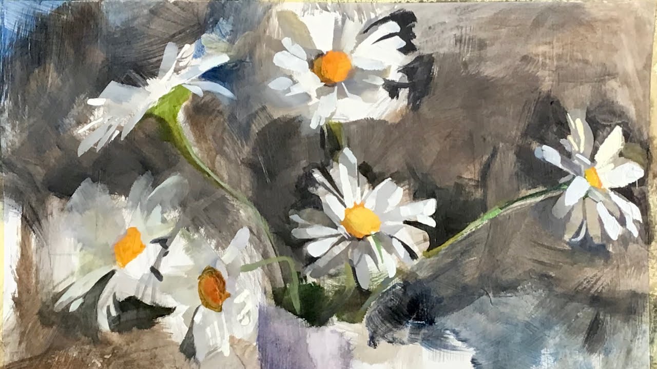
2. Don’t Overwork Everything — Focus the Detail
You don’t have to paint every petal perfectly. In fact, if you do, the whole piece gets noisy and loses focus. Instead, choose a focal flower — give it sharp edges, strong contrast, and rich color.
Let the rest fade a bit. Softer edges, muted tones, less detail. That natural blur around the focus makes the whole painting feel deeper and more alive.
3. Glazing = Your New Best Friend
This one’s a bit fancy, but super effective. After your first layer is dry, you can glaze (apply transparent color) to push and pull depth.
For example: add a warm glaze (like transparent red oxide) over a mid-tone area to bring it forward. Or a cool blue glaze to push petals back. It’s subtle, but it really changes the feel.
Glazing also helps create light effects without repainting the whole section — nice bonus!
4. Shadows Can Be Colorful
A mistake a lot of new painters make? Thinking shadows = black. Nope.
Try mixing deep purples, blues, or greens for your shadows — especially under petals or where leaves overlap. These shadows feel more natural and give a fresh energy to your painting.
Also, notice that shadows closer to the viewer are usually darker and cooler. Background shadows? Softer and warmer. That’s another easy trick for depth!
5. Add Reflected Light for Extra Realism
Here’s one pro-level move: add a hint of reflected light under your petals or between overlapping flowers. Think about it — light bounces!
So if a yellow petal sits above a white one, there might be a soft yellow glow reflected below. This subtle bounce makes your flowers feel like they actually exist in 3D space.
6. Soften Backgrounds, Sharpen Foregrounds
To really sell depth, use edge contrast. Sharp, hard edges bring elements forward. Soft, blurry edges make them sink back.
That’s why background flowers or leaves should be slightly out of focus — just like a photo with shallow depth of field. Blend them lightly with a soft brush or sponge, while keeping the front flowers crisp.
This trick works wonders for visual hierarchy.
Final Words: Trust the Light
Adding light and depth doesn’t need to be complicated. You just need to look at your scene with curiosity: where does the light hit? Where does it hide? Where should it bounce?
Trust your eye and don’t overthink it. Sometimes it’s better to leave a soft suggestion than to paint every single detail. That’s how mood and atmosphere happen.
So go grab your brushes, and let the light do the magic.