Ever Stared at Your Painting and Thought, “It Feels Off”?
You’ve blended your colors, painted every petal with care, but somehow… it looks lifeless. Flat. Almost like it’s stuck in 2D.
Don’t worry — this is super common with flower oil paintings. The good news is, it’s not hard to fix once you know what to look for. Let’s dive into a few easy ways to make your floral artwork stand out and feel full of life.
1. Introduce Depth with Foreground, Midground, and Background
Many beginner artists make all their flowers the same size, color strength, and detail level. That flattens your whole composition.
Here’s a fix: Arrange flowers in three layers:
- Background: light tones, soft shapes, little detail
- Midground: more defined, warm colors
- Foreground: crisp edges, shadows, and vivid colors
This trick adds instant spatial depth and leads the eye through your painting.
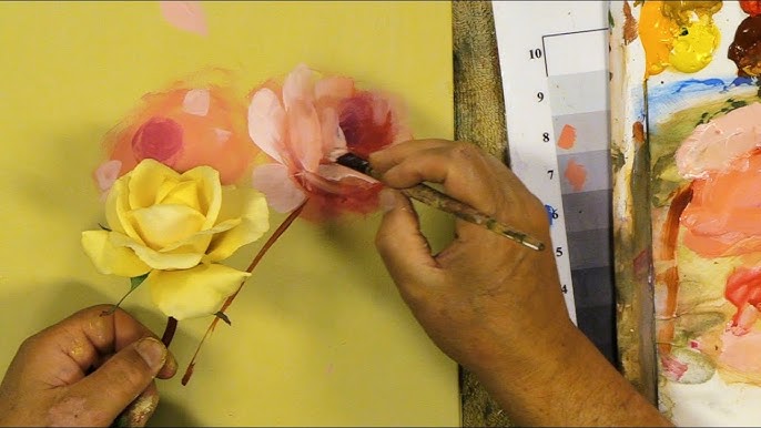
2. Light = Drama
Flat lighting is a killer of great flower paintings. You need a strong sense of direction — even in abstract florals.
What to do: Decide on a light source (like top right). Then build highlights on petals that face the light, and shadows on those turning away. Even using a tiny bit of white mixed into a warm color can lift your flowers off the canvas.
3. Avoid Using Just Midtones
Too much midtone color = boring. Your painting needs contrast to feel alive.
Try this: Squint at your painting. If nothing stands out or sinks in, you’ve got a midtone problem. Boost your darkest shadows (a touch of ultramarine or burnt umber helps), and clean up your highlights. It will instantly punch things up.
4. Add Texture with Paint Thickness
Flat paintings often lack texture — especially if the paint is applied too thin or blended too much.
Simple solution? Use impasto. Take a palette knife or thick brush and apply some juicy strokes on petals that are meant to pop forward. Let the paint sit. Let it breathe.
That rough texture not only adds depth — it adds emotion.
5. Don’t Ignore the Edges
All sharp edges? Feels stiff. All soft edges? Feels mushy.
Balance is key. Keep soft edges for distant flowers or shadowed sides. Use crisp, sharp edges only where you want the viewer to focus — usually the flower centers or front petals. That contrast will help pull certain areas forward.
6. Revisit Your Background
Some paintings feel flat because the background isn’t doing its job.
- Too light and the flowers vanish
- Too dark and the painting feels heavy
- Too similar in color? Everything blends together
Use background tones that contrast and support your flowers. Cool backgrounds (blue/green) can push your blooms forward. Warm backgrounds might blend better, but need edge work to separate.
Final Word: Don’t Be Afraid to Rework
Many artists think a flat painting is a failed one. It’s not. It’s just part of the process.
Reworking, layering, experimenting — it’s all part of learning. So take a breath, grab your brush, and give your painting the depth it needs to shine.